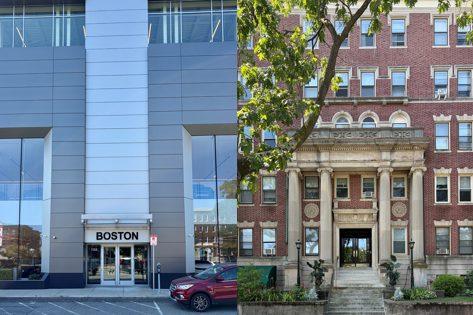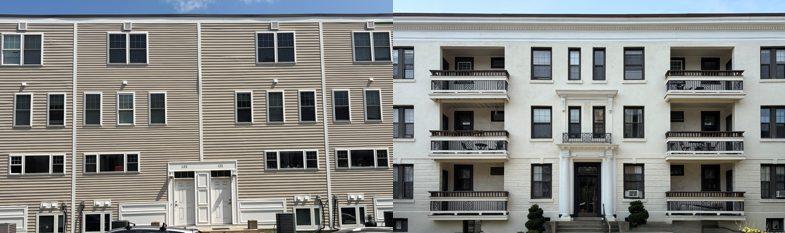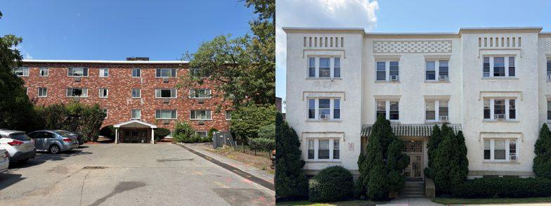
Allston is one of the most coherent urban neighborhoods America ever produced. Between 1890 and 1940, Allstonians built a harmonious village of single- and multi-family houses, brilliant courtyard apartments, commercial blocks with shops and restaurants, and world-class parks.
Neighborhood history
Allston’s coherence came from tradition and shared culture. Designers created works of art in the Classical Revival, Georgian Revival, Renaissance Revival, Mission and Art Deco styles. Each style is distinct, but they share a grammar: vertical, deep-set windows; clear entrances; strong masonry walls on solid foundations; a base-body-crown pattern; bold cornices; playful ornament; and charming small details.
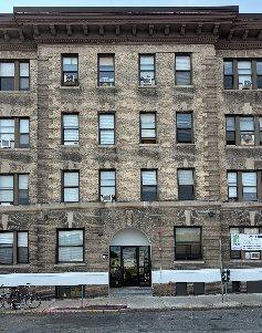
Allstonians built this urban fabric for the middle class. Aspiring young workers and up-and-coming immigrant families moving out of inner Boston found in Allston a gentle blend of affordable rental housing, fresh air and greenery, and closeness to jobs downtown.
Remarkably, they did it without spending too much. Elaborate stone columns were not carved. They were cast, so they could be repeated at scale and the apartments inside stayed affordable to middle-class families. One good cast-concrete lintel could be molded fifty times. A decorative brick panel required only a change in brick orientation. A cornice was built from repeating modules. Builders swapped expensive limestone for cast concrete. Allston has true masterpieces, but most of its housing was made as efficiently as possible.
Even while making homes that everyday people could afford, early Allstonians built beauty. Clever construction methods gave middle-class housing dignity and daily inspiration without the luxurious adornment of wealthy neighborhoods like the Back Bay.
This essay explains what makes our shared neighborhood beautiful, some of the ways we have lost our way, and concrete (pun intended) plans to return to our heritage as one of the most beautiful, affordable middle-class neighborhoods that Boston, and America, has ever produced.
What makes Allston beautiful
“In the end, we will conserve only what we love; we will love only what we understand; and we will understand only what we are taught.”Baba Dioum, conservationist
Understanding what makes a building a work of art takes some careful attention to detail. Here are the key lessons. Throughout, use the button on each photo to reveal the pattern.
Symmetry
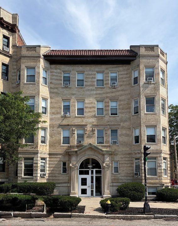
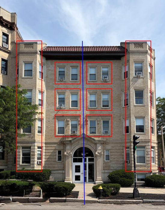
People have a basic preference for mirror symmetry. If you can fold something in half along a vertical line and the two sides look alike, it is symmetrical. Here is a neighborhood example:
Base, middle, crown
People “read” buildings the way they read a page, and like the best writing, we prefer it organized. The structure we look for first, often unconsciously, is the base-middle-crown pattern: the building looks grounded at the bottom, pleasantly organized in its main body, and deliberately finished at the top.
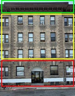
Each part has its own role: (1) a solid base of larger, heavier material looks stable; (2) a broad middle of windows and lighter details looks orderly; and (3) a heavy, overhanging roofline, called the cornice, looks complete.
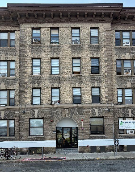
Here is an example on Commonwealth Avenue. Notice the first floor’s heavier-looking stone with big keystones over the windows and an arched door; the second through fourth floors’ neatly ordered windows against simple brick; and finally the heavy, overhanging cornice with ample detail on top.
Once you see it, you see it everywhere:
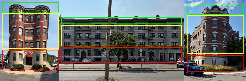
Solid foundations
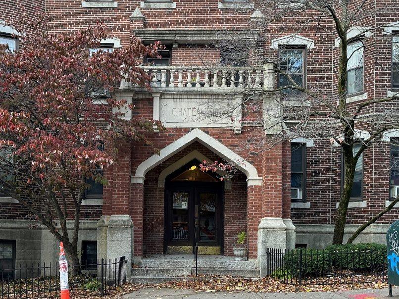
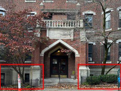
Humans have an eye for natural physics. We expect a building to look like it knows where the ground is. A solid foundation gives us quiet reassurance that the weight above is properly carried. That is why, in the base-middle-crown pattern, the base always looks more solid, more foundational, than what sits above it.
Here, solid stone forms the base for the brick above:
Patterns
We delight in finding subtle patterns, and the best architects hide them in their buildings like Easter eggs. With a little practice, you can spot them yourself.
One pattern is rhythm. As in music, we like a tempo to our buildings, created by spacing windows, columns or small details at regular intervals.
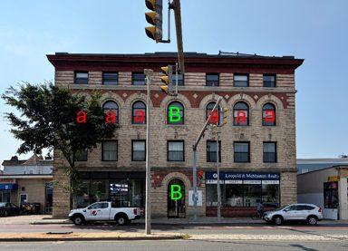
In the building below, tight window spacing forms an a-a-a-B-a-a-a pattern: the central arched window on the third floor stands out just a bit from its neighbors on either side, and it matches the door below. The arches bounce us along horizontally, while the plain second-floor windows stay out of the way of the action above.
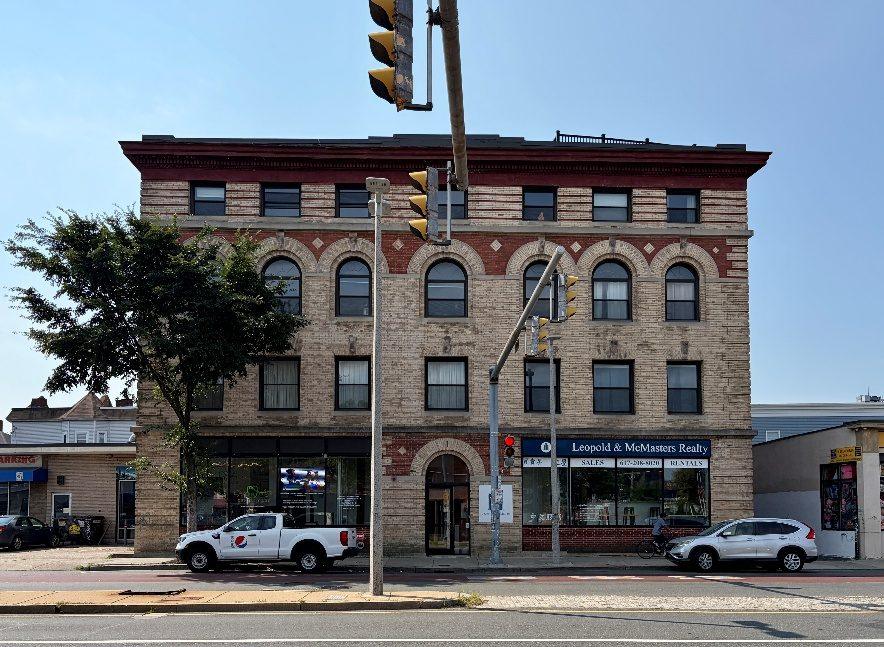
One building can hold several patterns. This one combines base-middle-crown with paired gables, triplets of windows and repeating arches:
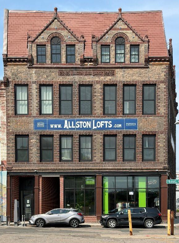
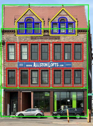
You may notice that the architect broke the rule of symmetry with the windows. This building will not be admitted to the symmetry section.
Grand entrances
Some details are kept subtle; others are meant to shine. The best architectural artists concentrate their finest craftsmanship at entrances, roofs and windows.
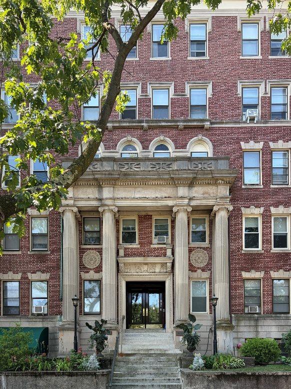
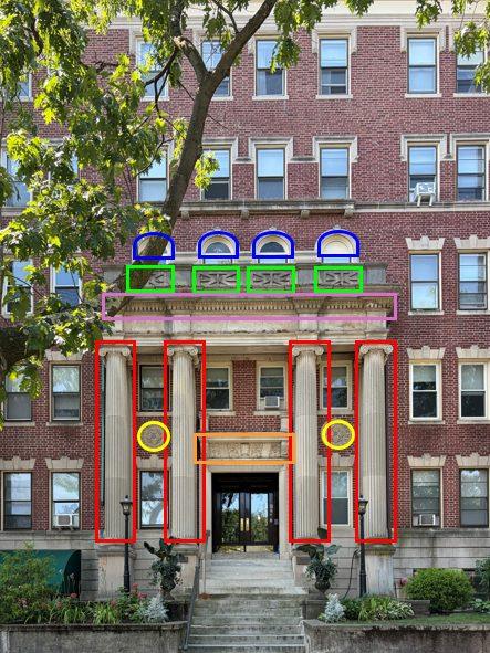
In this Allston example, Doric fluted columns support a massive entablature with dentil decoration, topped by pierced parapet panels with geometric ornament and framed by arched windows. The doorway is decorated with a carved frieze, and two stone roundels add more ornament.
Modern design authoritarianism
Why it disappoints
Asymmetry
Modern architecture often discards symmetry for a more visually striking design. That may excite the architect, but it can be unsettling for neighbors who pass the building every day. Here is a recent example:
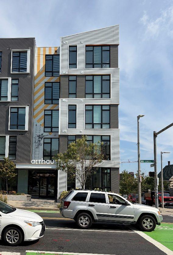
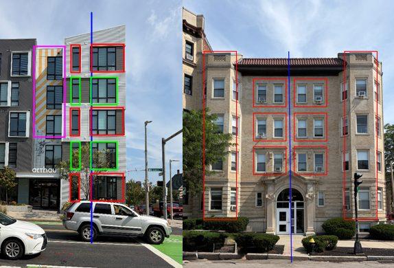
This building has no central axis. Its roof angles awkwardly up to the right, and a new pattern of yellow lines, some vertical and some diagonal, simply appears on the left. Compare it with our first example of symmetry:
Breaking patterns, abandoning principles
Modern architecture generally avoids compositional harmony. It rejects the base-middle-crown pattern, settles for weak foundations instead of solid ones, resorts to random window patterns, and hides entrances instead of celebrating them. Here are examples of each, and how they make buildings much less enjoyable.
When a building abandons base-middle-crown, it can look as unstable as it looks sad. Here is an Allston building with no base, a chopped-up middle and no top:
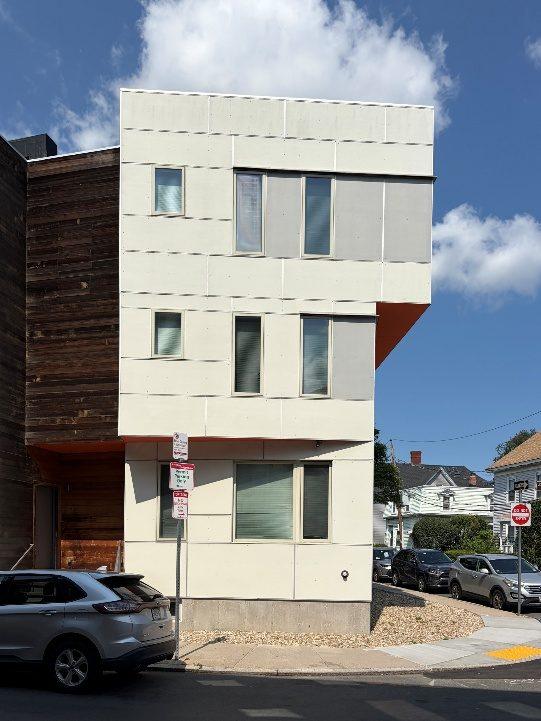
Compared with one of our original examples, it is easy to see what’s missing:
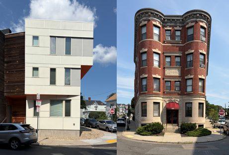
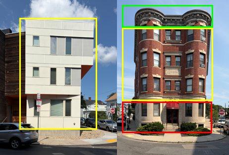
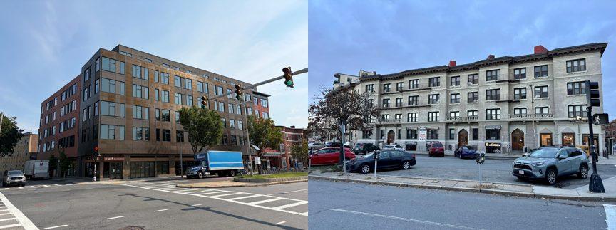
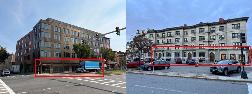
When modern buildings do attempt a rough base-middle-crown, they usually leave the base weak, like an empty void. Instead of a strong foundation, the bottom retreats darkly beneath a hulking middle. Allston has many examples. Here are some, next to traditional comparisons:
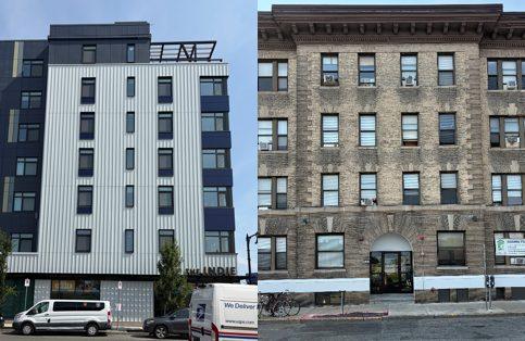
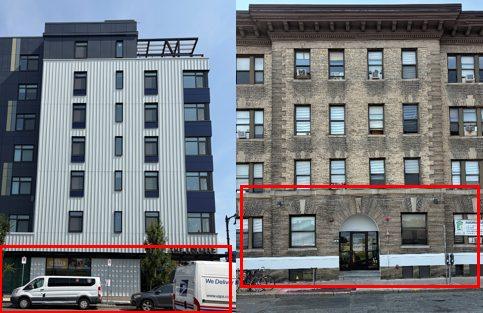
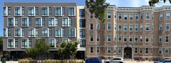
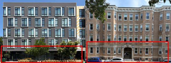
Modern buildings often forget to give their windows a pattern, which creates a kind of bleakness. Below is an Allston building with four different windows, none matching the others, shown beside the Allston Lofts building:
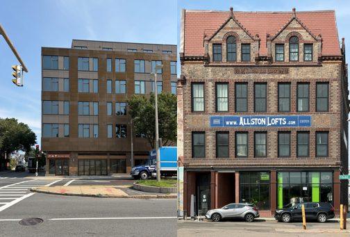
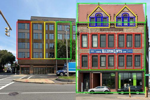
Finally, where traditional architecture celebrates and magnifies entrances, modern architecture often hides or diminishes them. You can decide for yourself which you prefer:
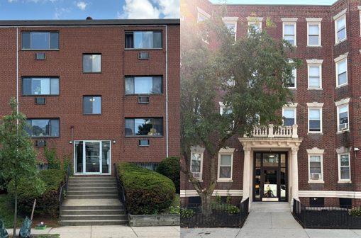
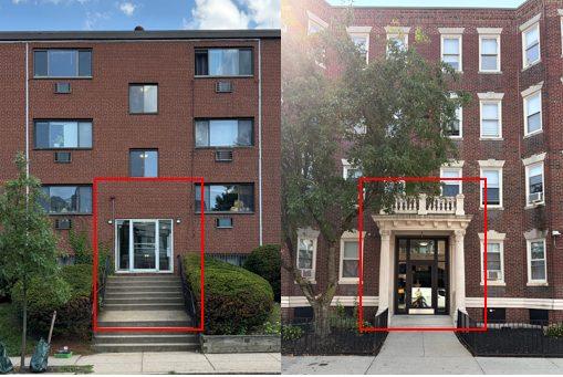
Plain
The greatest break between traditional and modern architecture is ornament. Modern buildings are plainer. Below are examples from around Allston beside their traditional peers, and the comparisons speak for themselves. Every pair was photographed on the same street.